Interaction Design Projects - Case Study
IE Resource Management System Overview
 Project Overview:
Name: IE Resource Management System.
Development of resource management system for the Information Environments Program at the University of Queensland. Development of database schema, web interface, user access levels and a function workflow for system interaction.
Duration: Version 1 completed
Status: Currently in revision for version 2
Design Objective: To put the booking and management of Program equipment and resources into an online system.
Why?
- student/staff accessability of equipment availability,
- transparency of equipment inventory,
- improved ease of management for equipment loan through tracking of usage and returns,
- improving workflow for staff involved in the actual equipment lending,
- centralising of access to borrowing through university ID card system and barcoding of all equipment items,
- decentralising of responsibility of loans through the admin interface,
- improving borrowing/return processing time (for both students and admin),
- maintaining University of Queensland corporate image and web guidelines.
The Process:
Understanding the problem - discussions with student and staff users regarding their frustrations with current process. Observation of admin staff process and workflow regarding equipment borrowing. Understanding the real nature of the problem.
Exploring problem space - developing design mockups and exploring potential system workflow's. Research into centralised systems for borrowing and inventory collation (university ID card, barcodes and barcode readers. Mockups and scenarios of use where shown to select students and admin's alike to auger ease of use and workflow.
Testing the interaction - Once a base system was developed, a limited onsite deployment was conducted. The admin staff were shown system operation and asked to use in tandem with existing paper-based system. Improvements to system interaction were made based on this deployment.
Reiteration, training and deployment - With assistance from external staff, populating the system and usage of the system was completed. Final refinements were conducted and any feature bugs ironed out.
Monitoring the deployment - The initial version of the deployment was monitored closely to assist in correcting unforeseen issues. User feedback was gauged for future improvements and features.
Assorted screen grabs from the system showing interface and walking through aspects of the interaction flows of users and admin alike.
 |
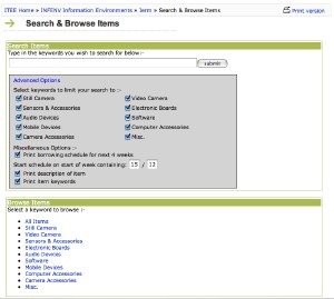 |
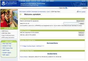
| 1. Admin Splash page for system. Gives an overview of current borrowed and booked items, with admin controls. At loan desk, ID card barcodes can be scanned to gain access to student records, with all equipment individually barcoded [ barcode example ]. The barcode is automatically generated as an item is created in the system. | 2. Search controls. Uses tagging of items through keywords for ease of use. Items can also be located through ID numbers. |
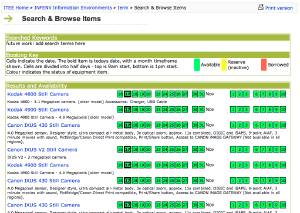 | 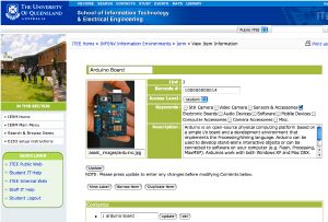 |
| 3. Search availability display. Displays search returns with availability of items over the next month. Each items links for more information. | 4. Detailed view of items. This version shows the admin access with all fields editable in the page. |
 |
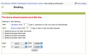 |
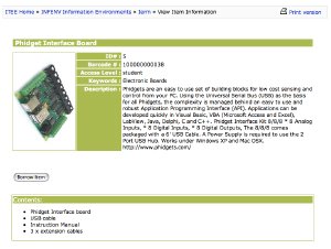
| 5. Regular user view of item detail. Note the lack of editable regions and admin access controls. | 6. Booking interface. Provides user feedback if items are already out or reserved in system. |
Reflection: One of the largest aspects to be considered during this project was physical interactions and workflow of the people who administer the system. At the outset the design problem was seen to be the transparency of booking and availability to all users. This problem was moderately simple to solve through an accessability online system.
Initial observation and user discussion revealed a deeper problem. Understanding how to scale a system which would address the major problems of equipment logistics at the borrowing desk was a larger issue. Being solely responsible for the location of equipment, particularly when items go astray was a substantial issue. By sharing the administration through the system, enabling ease of equipment tracking, flagging trouble items or users to admin's and aiding the equipment admin's in facilitating the process.
Reducing the amount of time required to lend out or return an item was also a priority. The old system involved a folder kept at the counter for loans items to be input and a separate paper-based diary to place bookings in. One person was the point of contact for all equipment interactions, and if an item was not returned on time, it was usually not noticed until the next person came to borrow the item. The addition of new equipment into the system was also a concern. Improving the interaction of this aspect proved to be a larger issue than originally considered resulting in streamline system of duplicating and modifying existing items with automatic label and barcode generation.
- --------------------------------------- -
Previous interaction design project work can be viewed through the academic section of the website - [ projects ] .
